Thursday, 19 December 2013

Brain Power / Festive Pitstop.


As part of some extra research for my Grad 1 Brain project myself and my friend Iona (who happened to be visiting) decided to take a trip to the Museum of Science and Industry in Manchester to see Brains: The Mind As Matter (website here) an exhibition which asks not what the brain does for us, but what we have done to the brain in the name of medical intervention, technological change, cultural and scientific enqiury. The exhibition itself is free and and features over 160 artefacts including real samples of brains.
 Once we arrived in Manchester, we got the free bus to the museum and were greeted by tunnel of screens, all part of an iterative device for the museum which I think is a great idea, so here are a couple of pictures of Iona and myself looking slightly ridiculous!
After we got ourselves a map and found our way to the exhibition we found out that sadly photographs were not permitted inside, but I manage to get a few sneaky pictures on my phone, not great quality but still.. 


I will admit that at times I did get a little freaked out at the brain samples, the thought that at some point within the past 100 years, those brain slices used to be inside someones skull, apart of someone, the thought and life of someone. To me it was a little freaky but besides that it was a really interesting exhibition. Inside the exhibition had a range of books and illustrations dated all the way back to the 1800's and I think some even further than that, the kind of tools and equipments used in the experiments and examples of different brain diseases - One of which showed the softening of the brain where dementia had taken over the brain. 
In terms of research I think some of the information that I learnt wasn't particularly useful to my project but being able to see first hand the medical illustrations and how things were documented will really help in my development and to help me think about how I'm going to structure my final outcome. 

After the exhibition we had some time to kill before our train so decided to grab a little lunch, a festival coffee and head over the Christmas markets. Neither of us had ever been to them before so it was really lovely and really got us both in the festival mood! So here are a few snaps from the rest of the day. 


We were amazed by these handmade lights we found at the markets, so much so that Iona has found a link online for instructions which I will leave here for you! Paper Star Lanterns 

Monday, 16 December 2013

Graduation Project 1 || Assessment


As part of our formative assessment at uni we are asked to produce 4x A3 boards, this to outline the main points of four areas; Research, the idea, development and final outcome. It's a really useful way of clarifying to yourself your ideas and aims for a project and to also make sure that it has direction. Its also help to know whether people can pick up your ideas just by reading your boards, that way you can be sure that the correct information has been used and it's a full proof idea. 
I thought I would just show you my four boards, the feedback I got back was good and my tutor picked up on my ideas and aims and seemed really positive about the idea. I'd love to hear what you think.. 


Sunday, 15 December 2013

Graduation Project 1 - The Brain


Everything About One Thing || Brief ||

Gather a complete knowledge about one single thing and make that accessible for the public in the form of either a book, magazine or digital presences.  

At the start of this project I thought about many possibilities for my topic a lot of which were personal interests but wanted to chose a subject that I wasn't so familiar with and something I could really question. I did a few idea generating games such as hot potato and word association and eventually came to the brain. A subject that we know of but don't fully understand, thus started some intense and quite tedious researching.

I started by looking a basic facts and information, the kind of information we learnt about in school and the kind of information that we grow up knowing.
I thought this would be a great topic as I think there are still so many thing to learn about the brain and there are so many myths and mysteries, I thought it would be interesting to investigate.

Alongside basic information I have also started looking into things that we don't fully understand, things that perhaps the brain cannot work out, to answer the questions that we might not understand like where memories are stored, how perception works and whether religion is something that is automatically in the brain and where that might be stored.


After starting my initial research I moved on to looking at visuals, how the brain was used in information, how its used in simple design and how different ways showing the brain, for example the materials that I could use to make/draw/design the brain. This helped but I was still unsure of what I wanted to do with the information and how to make it more visually interesting. After a tutorial, one of my tutors told me about The Human Body App designed by Kelli Anderson. In short she designs and made the human body from card and paper and produced a stop motion of the functions, it's a brilliant app to help teach and got me thinking about more exciting and fun ways to help me use my information. 

              
        Website/blog                                                                                                                                                        App

At the moment I am still working through the information and developing a few ideas but hopefully soon I will have some more development to show you all. Although its quite a large and quite difficult topic, I think with the directions I'm going with this I'll be able to meet the brief and come out with an outcome to add to my portfolio. 
In my next post I'll be sharing my assessment boards basically explaining my thoughts progress and outcome ideas! 

I'd love to hear what you think, whether this is good idea for a project?, what you would do your project about? etc I'm always interested to know! 
Until then thanks! 

Friday, 13 December 2013

Dirtyface Live Presents:

This event happened a while ago now but sadly have only now gotten the chance to write a post about it so please excuse how late it is aha!  

A couple of months ago Nikita found out about this amazing evening of live art taking place at the Millennium Gallery here in Sheffield and curated by Dirtyface. Dirtyface  are group of artists and designers from around the world working with other artists and designers. Website here. 
The evening held was an opportunity to see some of the UK's most talented contemporary artists each with their own themed performances. A great chance to see amazing artists live at work, doing what they do best.
The night itself was fantastic! The atmosphere was great, a real buzz around the room, the interaction from the artists to the audience and just to be in a great creative space surrounded by creative people was inspiring.
A personal favourite of the evening and a great addition to the evening was the interactive piece that Sheffield designer Nick Deakin put together. A mural of his work on the wall which was open for the audience to get involved with and add to.
Here are a few pictures of a couple of friends taking part and adding there artistic touch.

It was an amazing night and another highlight for me was definitely seeing Jon Burgerman's skype live drawing session. I've been a big fan of his work since college and to interact and watch him at work was amazing. You will have to excuse the quite poor quality of the images, they were taken on my phone but here are some pictures of the evening that I wanted to share with you. 


Taken from the website
"Perhaps our biggest coup to date, Jon will be performing live via satellite (sputnik we think) link from New York. He'll be digitally illustrating, reacting to live audience participation via his twitter feed and web cam. Jon's work is internationally renowned and we're privileged to bring his own unique style of illustration to Sheffield's leading contemporary art space, Millennium Gallery.

The live art cube featuring Tom J Newell, Guy Mckinley, Craww and Jo Peel will demonstrate the art of live illustration. There are no themes, limitations or restrictions. Each artist is free to express their style. Our ethos has always been to showcase talent rather than constrain it, so we want you to enjoy these artists for what they do best!

Nick Deakin will provide a very special mural collaboration by creating a giant colouring book, all that's left to complete the mural is your input! We're inviting the people of Sheffield (any beyond) to team up with Nick and help finish off his large scale mural by colouring the thing in. All materials will be provided on the night so just bring your imagination.

As part of Nick's mural project we'll be releasing a limited edition screen print on the night, featuring Nick's mural design. It's your very own colouring in print! Screen printing courtesy of Crow and Dunnage.

Jon Boam will be illustrating his very own character work onto our custom, dirtyface toy. Get up close and person with Jon by working up your very own mock up of Jon's character. More will be revealed on the night.

Get Perspective will feature the work of Rob Lee, a talented, geometric artists hailing from Sheffield. Rob's work is all about the live experience and the position from which it's viewed. We're expecting big things from Rob in the coming years and it's a great opportunity to showcase the work of a chap forging a unique style, something that's quite rare in this day and age.

And finally...Mr Silvester will bring the seaside to Sheffield (almost) as his Facetime project allows you to put yourself in the artwork. Bring your cameras as the best Facetime image / clip wins some very special dirtyface goodies.

Ohhh, and we'll also be treated to the very talented work of Dj Andy H, providing the beats on the night. "
The can't say enough about how great the evening was and a big thank you to Dirtyface for putting it on, it really inspired me and I really hope they produce something like this again in the future. 
I shall end this lengthy post with this picture of the gang from the evening. 


Thanks! 

Sunday, 1 December 2013

Ordered Chaos has begun!


Got an extra little post for you today/this evening and if you already follow me on most other media sites then I apologise in advance because you will of already seen this about 6 times in the past two days aha! 

But the point of this little post is that myself and my friend Gemma have put together a blog on tumblr for our graduation project.The point of the blog is for people to be able to see what we're up to and to even get involved with it. 
Intrigued?! 

Well head over to orderedchaosblog.tumblr.com  and find out more about what the project is and what we're doing. 
We really do appreciate it! 

Thanks E x 

Creative Spark


The idea behind this brief was a competition to rebrand the Creative Spark brand for the University. Creative spark is an exhibition which takes place every year at Sheffield Hallam University and is like an end of year show for graduation students. Every year the brand is changed and new concepts are build, being in the final year of my course it was my year's turn to have a go.
We were asked to re design the Design departments of the exhibition, this includes, product design, graphic design, fashion, media etc.
I teamed up with a couple of friends and designers from my course Nikita and Gemma and started the project by researching past competition winners and what themes and designs they used.
We wanted to come up with something new, still fitting in with the university guidelines and showed that there is a lot unseen talent and work.
A few words and Ideas we came up with for our brand were; bold, simplistic, iconic logo, creativity and something that had a bit of atmosphere and movement. We thought about themes we could base our idea on and thought what better theme than Sheffield and its buildings and structures.
If you've ever been to Sheffield or knows anyone from here he would know about the amazing variety in architecture that this city has to offer. Park Hill being one of those influential places we wanted to somehow include this in our design. We went up to park hill and took a few pictures of the structures before messing around with them in photoshop. To go with this we looked at other structures around the university to overlay, this happened before designing the logo.
We thought that this would be a good route to go with, the target audience for this brand was to it be for current students, parents and friends of students, the public, designers and professionals and new students and families. We thought about how much talent lays within the walls of Sheffield Hallam University, how proud of it we are and how much potential it holds.

For the logo we wanted something that would have a 3D effect, something that would pop out to the target audiences and to be fun, something people would stop for and want to find out more. When researching we looked at 3D typography and using materials such as string, wood and typography with 3D structures to tie in with the rest of our design. After a bit of development work we realised that at the scale we were working at which was A4 wasn't really working and decided to work these ideas up in Illustrator.


 The idea behind these were the use of pins and string, linking all the letters and words together. Linking was a bit part of the design for our idea and each piece of string or line would represent the links between the different areas of design. After working these up we decided that the designs didn't really for fill our wants and decided to move on from this.
For looking at past winners we noticed a huge use in shapes and adapted this to our 3D design ideas. As you can see the logo at the top of the page was the logo we eventually ended up with, each of the arrows representing the design fields and people. The colours we chose were that of the university colours, we thought it would be a good idea to keep them within the branding guidelines we were given.

Next we worked on the typography for the brand, as a general design rule to stick to 3 typefaces we chose Helvetica, Myriad Pro and BodoniXT. All that was left after that was to apply it to all of the areas that needed branding.

My area of the branding was to redesign the website, produce the letter head, formate the guidelines and as a bonus produced a winners letter for the winners of the award that is given out every year.
Again everything we used stuck to the branding guidelines of the university. On the website I kept all the links that are available on the original but just livened it up. After looking at the original I decided that I wanted to design something that was more eye catching and interesting to the user, rather than dull and lifeless. I think the use of the arrows from the logo on the homepage was a nice touch as well as adding the structural design to the page which linked the designs together. The winners letter and cover letter are just simply laid out along with the university logo and at the bottom the guideline page of the colours and fonts we used.


The Website

Winners Letter & Cover Letter


Branding Guidelines 
My other group members produced the advertising that would be shown around the university and city as well as invitations to the event.  I think as a group we were really happy with our end results and how the whole thing tied together. After producing a powerpoint of our ideas we gave a presentation of the re brand and was it. Sadly we did not win but we were still really happy with what we had produced in the time that we did!. 

Friday, 29 November 2013

I am a terrible blogger!

Hello! 
I am terrible. A lot of things have been going on in the past few weeks,months even; an uproar of university projects, little trips, Dissertation work, all sorts; which has turned me into a very bad blogger and for that I apologise. I've got and had for quite a while now a back log of posts that are waiting to be made but finding the time at the moment to sit down and concentrate on them is difficult.
Hopefully soon things will slow down a little and we can resume to regular blogging and hopefully over the christmas holidays I will be able to update you on some of the exciting projects that have been taking up so much of my time. 
Until then I thought I would just leave these pictures which I think sum up pretty well what the past couple of months have been like.

A little self plugging here but if you are interested in what I've been getting up to, feel free to follow me on Instgram: ejgreaves77 
I post quite bit aha! 

Left: Get the book here: http://amzn.to/1dRslym    Right: Brainvasion - Valentin Scheiner 2013

Saturday, 26 October 2013

Inspired & Inspire Brief


Just before we went to London for the AGI Conference our tutors gave us a little project to reflect on the two days and come back with some quotes from the designers that we found to be inspiring or inspirational and to produce a poster from them. I will admit at first I wasn't completely into the task but once I started gathering quotes and after feeling very inspired after leaving London, I  thought this was a really good idea. The quotes I went with was;


"Design makes me frustrated, Art makes me crazy" - Paula Scher 

I went with this because I can totally relate. When I start designing something or have been staring a piece of work for so long I start to get frustrated and the same with art and in an odd way it almost makes me feel like it shouldn't make as frustrated as it does. As in "I'm a graphic designer, doing design shouldn't make me frustrated" but after hearing her say this out loud, it kind of made me realise that of course everyone gets like this from time to time. So I thought this would be the perfect quote to use. 

I wanted to use a mixture of hand rendered design as well as working it up on photoshop. I really enjoy using and making collages so this is what I started with. I used scans from magazines and in particular found some great images taken by Rankin of mens faces squished together. I thought this was a perfect representation of frustration and used them in my final product. 


I also used a range of faces, shapes and colours to produce a messy collage of patterns to show the craziness and nonsense of putting an "art" piece together. I then after worked the scans up on photoshop, I messed around with layering the images together, changing the colours, contrasts and balance.
I knew for the two posters I wanted two different tones layered over the images, one for frustration and the other for crazy. I went for Red and Blue, as red was the first colour that I would normally associate with frustration and blue because I thought it was a nice contrasting colour.
After working it up in photoshop I added my type to the posters and this was the final outcome...


I'm actually really happy with the way the two posters have turned out, I think the frustration posters is the strongest of the two but I do think put together they look good and fit the brief completely. 


Tuesday, 22 October 2013

Deconstruction Brief.

With graduation projects and briefs coming up soon our tutors have been setting up workshops to help us get a better understanding of briefs and to help us dissect them and come up with some ideas for the current projects were doing.
Last week in uni we were given a talk on deconstructive designs and about dissecting briefs and pulling out the most important pieces of information.  In the session we were given large scale prints of the 5 grad projects (which I will expand on later) and told to dissect them, so we cut them up, and stuck them together in odd deconstructive designs.

After the session we ask told to go away and design our own deconstruction poster of the brief we had chosen for our graduation projects, picking out what we thought we the important parts of the brief and to experiment with typography, layout, space and composition.


This is something that I haven't really done much of before so It was good to get in practice with this as the graduation brief I have chosen might be quite typography based.


For me this workshop was actually quite useful, I'm very much one of those people who loves working with grid structures, especially 3 column grid structures so it was a challenge to try and get myself to ignore that mindset and be a little bit more creative and try to use the space in a more informal way and like I said, typography isn't something that I'm particularly great at so I found it useful to help me get into going though the process.

Anyway this was my final design;

For a first attempt at a deconstructionist design  I was actually quite happy with the outcome, it was interesting to mess around with font sizes and angles and to produce something that didn't necessarily have to make sense or look clean cut and perfect. Although I really like working with grid structures and having things very strategically placed, I actually really like the look of deconstructive design and in my design the use of extra large font sizes and colour. This is something that I think I'm going to keep working on and could actually turn out to be really useful when it comes to my graduation project.

Sunday, 20 October 2013

AGI Open

This post is a little late as this did take place a little under a month ago but it's finally here now! AGI Open in short is a large design and education conference held by the members of AGI and is a two day event which includes over 30 of the worlds leading graphic designers giving talks, debates and sessions. AGI is held in a different country every year and this year it was based in London and held at the Barbican theatre
Now we are pretty lucky to have the tutor we do as they booked us all free tickets to the conference and it was two of the most inspiring days I've had in a while. 
The range of work and design that was shown throughout the conference was incredible and to hear from such designers as Stefan Segmeister, Chip Kidd, Roger Law, Marion Deuchars just to name a few was amazing. 
I didn't manage to get too many photos in the conference as I just got completely sucked in and completely forgot to document everything. 
I did manage to get a few snaps on the second day of the conference and personally my favourite of the two days. I was really excited to see Segmeister's talk as I had perviously looked at his work for research on a project and also left that day with a few new favourites such as Chip Kidd and Paula Scher. 

Here is a selection of pieces from some of the designers there; 
1,2 - Stefan Sagmeister // 3 - Chip Kidd // 4 - Roger Law // 5 - Paula Scher // 6 - Marion Deuchars
Please do excuse the poor quality of these photos! 


The debate between designers on day 1. 


Stefan Sagmeister giving his talk and getting the audience to sing along.. 


The ending to the conference, Brazilian dancers (as next years AGI Open will be held in Brazil). 

I'll leave some links to the AGI website incase you want to know more about AGI or was there this year. I honestly can't thank the university enough for organising such a great event and I honestly don't even think this post could of done it any justice but it really was a great experience. I hope you've enjoyed this and until next time! 

Wednesday, 9 October 2013

Holiday Post Pt 4. The City


The 4th and final instalment; The City, Buildings and Architecture. 
(I am in no way an architect or know anything about buildings and their design so please bare with me, these are just my thoughts and I will try very hard to not ramble on too much!). 

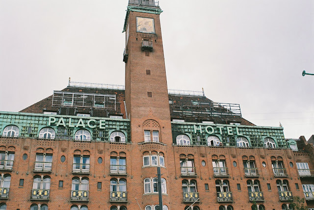
It has to be said that in my opinion Copenhagen is one of the most beautiful cities I've even been in. Whilst walking around the city I properly spend about 80% of the time looking up and staring at the top of the buildings and being amazed at how beautiful they were. The delicate details to the bright, interesting colours and the size of the buildings. Being from quite a small town in suffolk, I'm used to quite small, boring and uniform buildings, and even in Sheffield there tall, industrial buildings, a lot of mental, aluminium and of course, steel. It was such a difference to see everything so close together, so gigantically tall and so many windows. I think it was the old style of the buildings that really grabbed my attention. Okay enough of me trying to sound like I know whats what, Here are a few pictures of buildings that really got my attention. (I hope you have time because this might be long!). 


This street we came across on walking tour and couldn't get over how pretty it was, the combination of colours, the details on the windows and the rooftops. 


The town centre, again I love the tall exterior of the buildings and how they all look collectively.  


I'm not going to ramble on about each and every building because we really would be here all day but I just want to share a few pictures and hopefully spark some kind of want to travel because Copenhagen is such a beautiful city and if you haven't already guested a city that I am very much in love with. 
One thing that I haven't mentioned but really must is the amount of bicycles around. I've been to Cambridge and I thought that was a lot of bikes, Oh no, thats nothing compared to Copenhagen. I think it's such a lovely thing that Copenhagen is such a pedestrian friendly city and that there isn't too much traffic and cars everywhere, but bikes, my goodness. The amount of times we nearly got run over by bikes was insane, even thought they had their own lanes in the road. Within Copenhagen most things are pretty much within walking distance and because of this I can see why so people chose to cycle rather than drive.  
I'm not sure what else to say about them really other than they are beautiful and it's amazing that even after the city has had so many great fires, they have still built it up into such a beautiful place. 

I'm going to leave a few cheesy holiday snaps and phone pictures from the holiday and end it here! 

Taken on the walking tour, photo from facebook page. 


I hope you've all enjoyed the posts, me rambling, enjoyed looking through my pictures and hopefully I have inspired some of you to book a trip to Copenhagen soon!. Thanks for reading and new posts will be up soon!